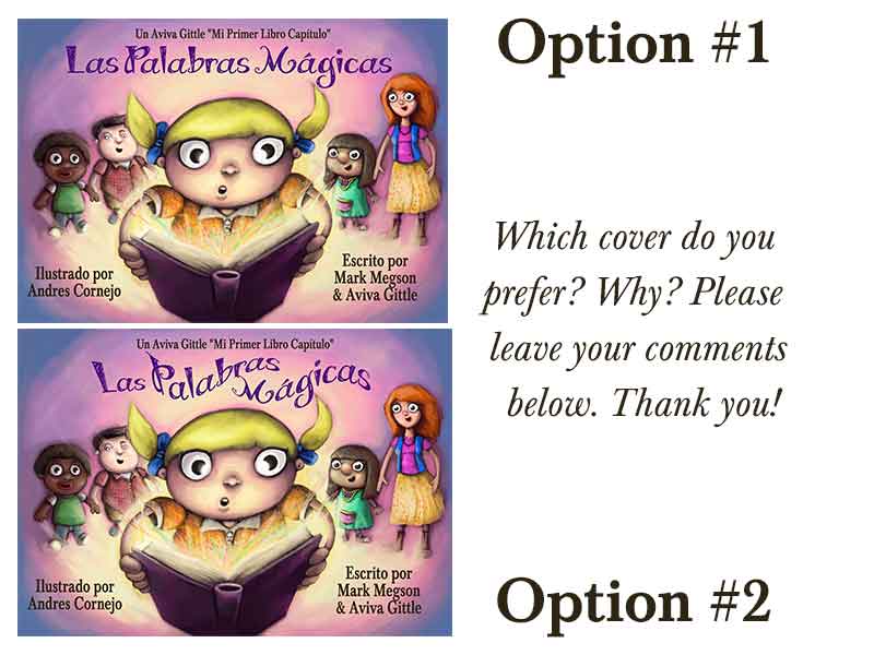
I personally prefer the wavy font in the second option. I don’t think it inhibits readability, it appears to capture the spirit of the book and it’s more visually engaging.
Good luck with your process!
avivagittle
Thank you so much, Elizabeth! I appreciate your taking the time to give me feedback.
I agree that option 2 is better. All your other text is straight line; curving the title make it stand out more. I think kids like to see something that is a little different, fun, and perhaps more engaging.
avivagittle
Thanks, Barbara. So far, it’s about 50-50 on the straight vs curvy. 🙂
I definitely like Option 2 better. The text is more exciting. I’m sure there are lots of straight lines inside the book, but on the cover, this design is both readable and compelling.
Number 2 “hands down” The font integrates so well with the image and really celebrates its (the image) cohesive feel. Let’s see… in other words… Your (wonderful) cover succeeds in creating it’s own universe – And the font in #2 adheres to “rules” of that universe…… really nice work –
avivagittle
Thanks, Gail! I appreciate the kind words. 🙂
Jen McCormick
Hello- I think an soft arch would be the perfect solution. Pretty light on the girls face!
avivagittle
Thanks, Jen. So you’re suggesting less curve? I’d have to experiment with it some more.
My first reaction was wavy and then I read the words magical. Wavy makes the story seem magical!
avivagittle
Thanks, Sheri. That’s kind of how I feel about it, too. The straight font just doesn’t seem to capture the magic. Several people on the LinkedIn forums prefer the straight and think it’s more readable. Not sure I agree.
I like the wavy letters. To me that’s part of the magic.
avivagittle
Thanks for the feedback, Claudia. The preference for curvy is far greater now as people continue to comment.
Jacquelyn Jobe
No. 2 is the best. The curvy letters not only go with her pigtails but they give the cover an air of mystery. It makes a child want to read the book. Very beautiful.
Option one, with a soft arch and a more pronounced matching larger type, for just the L,P and M, Try dropping the L,P and M down below the actual word text.Thus creating the illusion that the actual title appears to look shorter.
avivagittle
Thanks for the suggestions, Michael.
Tim McCarthy
I like the second approach. However consider making the title font larger and create a highlighted shadow effect behind the text by reducing the illustration to 85 percent. Show the entire book in the illustration which is cropped. The illustrator and the authors detract from the image and should be on a single line the full width of the cover with a large gap between illustrator and author.
avivagittle
Thank you for the suggestions, Tim. Others commented that the placement of the author / illustrator names is distracting.
The wavy title looks better, but as someone said earlier, the “M” needs adjusting to become readable. Good luck with your book launch!
avivagittle
Thank you, Peter!
Jean
Aviva, Definitely the first cover so that when the image is done smaller, the text can be read better. Experiment with it to see what you think. Spacing between character and/or words will make the readability better too. I think it is really important that the cover title be seen so there is no question. That said, the curvy is okay too, but it would need to read better in a smaller image. Food for thought. Really like your color balance. People images are pretty clear. All the Best to you and your success!
avivagittle
Thanks for your feedback, Jean. My feeling is that I can do a separate cover for the Kindle thumbnail (all my books are sold on Amazon). But, the best solution is if the full-size cover looks good as a thumbnail.
Athina Paris
I prefer number two. Magic is not straightforward so the curves and loops convey its playfulness. But do look at the letter M, it needs some tweaking.
Thank you for the feedback, Nathalie. And you also taught me how to say “good luck” in Spanish! Hablo Espanol muy pequito. Lol! (I hire professional translators to translate the stories from English to Spanish.)
Thank you for your comment, Dirk! Posting this was incredibly helpful. At the end of the day, I’m going to select what I think is best; but I find it’s dangerous to work in a vacuum. You can miss so much. In this case, it was getting feedback on readability and aesthetics. But, I got a bonus: Someone pointed out another problem in the design. (I won’t go into the gritty details.) Not fixing that issue could have been disastrous.
I like the straight. There is a lot going on in the illustration, no need to make it harder to read. The youngsters are the target, and they need an easy font, and an easy view of the font to feel success at reading the cover. I am wondering if the ( excuse the expression) bug eyed look is part of your style or are the characters on the cover super surprised about something? If not, then I would reconsider using the same eye on every character. I know the work is very stylized, but eyes are so very expressive, and you loose a lot of opportunity for expressions with using a super stylized eye in every pic.
Thanks for your comments, Claudia. The book has been illustrated by Andres Cornejo. The children are indeed surprised by the magic sparks coming out of the book. We are, however, going to remove the characters behind Mary (for other reasons). Art is just subjective. I’ve had people love the illustrations and a few others — not so much. I’m very happy with it, obviously, or I would not be publishing it. Lol!
I personally prefer the wavy font in the second option. I don’t think it inhibits readability, it appears to capture the spirit of the book and it’s more visually engaging.
Good luck with your process!
Thank you so much, Elizabeth! I appreciate your taking the time to give me feedback.
I agree that option 2 is better. All your other text is straight line; curving the title make it stand out more. I think kids like to see something that is a little different, fun, and perhaps more engaging.
Thanks, Barbara. So far, it’s about 50-50 on the straight vs curvy. 🙂
I definitely like Option 2 better. The text is more exciting. I’m sure there are lots of straight lines inside the book, but on the cover, this design is both readable and compelling.
Cuvey/wavey.
I like the #2 options. It’s screams fun. I would tweak the “M” for better readability.
You have a good eye, Kristine. Totally agree that the “M” needs adjustment.
Curvy because it flows like the wind and adds life to the cover! The girls hair is up so it works beautifully!
Thanks, Laura!
Number 2 “hands down” The font integrates so well with the image and really celebrates its (the image) cohesive feel. Let’s see… in other words… Your (wonderful) cover succeeds in creating it’s own universe – And the font in #2 adheres to “rules” of that universe…… really nice work –
Thanks, Gail! I appreciate the kind words. 🙂
Hello- I think an soft arch would be the perfect solution. Pretty light on the girls face!
Thanks, Jen. So you’re suggesting less curve? I’d have to experiment with it some more.
My first reaction was wavy and then I read the words magical. Wavy makes the story seem magical!
Thanks, Sheri. That’s kind of how I feel about it, too. The straight font just doesn’t seem to capture the magic. Several people on the LinkedIn forums prefer the straight and think it’s more readable. Not sure I agree.
I prefer #2. The wavy font looks fun and is indicative (to me) of the journey the story will take the reader on.
Thanks for the feedback, Erin. I feel the same way!
I like the wavy letters. To me that’s part of the magic.
Thanks for the feedback, Claudia. The preference for curvy is far greater now as people continue to comment.
No. 2 is the best. The curvy letters not only go with her pigtails but they give the cover an air of mystery. It makes a child want to read the book. Very beautiful.
I agree. Thanks for your kind words, Jacquelyn!
Option one, with a soft arch and a more pronounced matching larger type, for just the L,P and M, Try dropping the L,P and M down below the actual word text.Thus creating the illusion that the actual title appears to look shorter.
Thanks for the suggestions, Michael.
I like the second approach. However consider making the title font larger and create a highlighted shadow effect behind the text by reducing the illustration to 85 percent. Show the entire book in the illustration which is cropped. The illustrator and the authors detract from the image and should be on a single line the full width of the cover with a large gap between illustrator and author.
Thank you for the suggestions, Tim. Others commented that the placement of the author / illustrator names is distracting.
The wavy title looks better, but as someone said earlier, the “M” needs adjusting to become readable. Good luck with your book launch!
Thank you, Peter!
Aviva, Definitely the first cover so that when the image is done smaller, the text can be read better. Experiment with it to see what you think. Spacing between character and/or words will make the readability better too. I think it is really important that the cover title be seen so there is no question. That said, the curvy is okay too, but it would need to read better in a smaller image. Food for thought. Really like your color balance. People images are pretty clear. All the Best to you and your success!
Thanks for your feedback, Jean. My feeling is that I can do a separate cover for the Kindle thumbnail (all my books are sold on Amazon). But, the best solution is if the full-size cover looks good as a thumbnail.
I prefer number two. Magic is not straightforward so the curves and loops convey its playfulness. But do look at the letter M, it needs some tweaking.
Thank you, Athina. Good point!
I prefer #2 because it best fits the title. I also agree with the suggestion to fix the “M”. Very nice!
Thank you, Jonathan! Definitely going to have to do some “M” work. 🙂
Option #1 because my eyes focus dead on the title as oppose to moving to read wavy text print.
Thanks, Patricia. Several people brought up readability, but you’re the first to bring up focus. Good point. 🙂
I prefer the curvy one. It better fits the image and creates less competition with the rest to catch my eye. Buena suerte!
Thank you for the feedback, Nathalie. And you also taught me how to say “good luck” in Spanish! Hablo Espanol muy pequito. Lol! (I hire professional translators to translate the stories from English to Spanish.)
From a purely readable perspective, I think Option #1 is marginally easier to read. The artist in me, however, likes the undulating script.
Does that make it a statistical jump ball? If so, which do YOU like better? Go with that.
Thank you for your comment, Dirk! Posting this was incredibly helpful. At the end of the day, I’m going to select what I think is best; but I find it’s dangerous to work in a vacuum. You can miss so much. In this case, it was getting feedback on readability and aesthetics. But, I got a bonus: Someone pointed out another problem in the design. (I won’t go into the gritty details.) Not fixing that issue could have been disastrous.
Definitely Option 2 – The Title looks so much better for the style of the cover! Tory Allyn
Thank you for your feedback, Tory! I’m very likely to do some variation of the wavy font.
I like the straight. There is a lot going on in the illustration, no need to make it harder to read. The youngsters are the target, and they need an easy font, and an easy view of the font to feel success at reading the cover. I am wondering if the ( excuse the expression) bug eyed look is part of your style or are the characters on the cover super surprised about something? If not, then I would reconsider using the same eye on every character. I know the work is very stylized, but eyes are so very expressive, and you loose a lot of opportunity for expressions with using a super stylized eye in every pic.
Thanks for your comments, Claudia. The book has been illustrated by Andres Cornejo. The children are indeed surprised by the magic sparks coming out of the book. We are, however, going to remove the characters behind Mary (for other reasons). Art is just subjective. I’ve had people love the illustrations and a few others — not so much. I’m very happy with it, obviously, or I would not be publishing it. Lol!