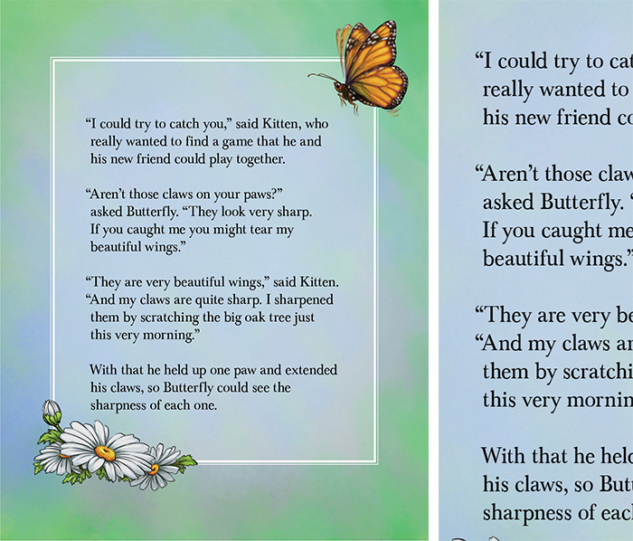
The person laying out my book saw an article or video that claimed that lining up the opening quotation marks outside the remaining paragraph was a cool thing to do.
I think it looks okay, but strange. Fixing it is a whole ‘nother ball of wax. I could live with it, but as a self-publisher, the last thing you want is someone in the industry to open up the book and scream, “Amateur!” before they’ve even read one line.
So, Punctuation and Layout Police — is this an offense? Please leave your helpful comments below. Thank you!
Fire the person. He/she is wrong. No publisher sets quotation marks outside the paragraph.
Hi, Tannera:
I’m going to repeat here what I said in the LinkedIn group:
“Oh, my, Tannera. I appreciate your feedback, but that is way too harsh. Sergei is a wonderful artist who took on this project at a very reasonable rate. His wife is doing the illustrations for my 8-book Kitten and Friends series. He made a judgment call that just didn’t work.
All the other design elements of the pages and the back cover are completely his. He has done an incredible job. Under normal circumstances, I would never be able to afford to get this project done with artists of this caliber. I knew when he took on the layout job that he was new to InDesign. It was a win/win. I’m also very fortunate to be part of the LinkedIn community. No smoke there; I truly mean it. Where else can you get free advice from so many experienced and talented people? :
While it is true that text is set with the quotes within margins, quoted headlines of more than one line are often set with the quote marks “hanging”. This is especially evident if the headline is lined up with the left margin, as the larger point size will make the headline appear visually, to be indented if the quote marks are set flush with the left margin. Sometimes, call-outs are also set up with hanging quotes for the same reasons. I spent more than twenty-five years in advertising & publication design, and the hanging quote is a useful design element, but not for blocks of text copy.
Thank you for your comments, Richard. It became clear quite quickly from the feedback I received from pros in the LinkedIn community that this must be corrected. My guy meant well; it just wasn’t a good choice.
Looks Like a mistake even if they are correct. I would not want it myself.
I’m in agreement, Lisa. And so are many that were generous with their feedback. We will be correcting this. Thanks for your feedback!
This does work as a distinct style. While it’s not grammatically correct, it’s not an offense or even offensive.
If you want it to be “perfect” and not have the grammar trolls coming after you, certainly, you could correct it. However, I do like how it looks and, for better or worse, it’s called a hanging indent (check MS Word’s paragraph dialog).
Thanks so much, Dennis, for taking the time to provide feedback. You are a lone voice in favor of the hanging quotes. Lol! That doesn’t mean you’re wrong. But, I’m not particularly crazy about them. In fact, I tried to change them on my own in InDesign and ran into all kinds of issues. The master pages need to be changed and I am barely a novice user of InDesign. Between my layout guy and me, we will work it out. 🙂
Doesn’t seem worth the risk of overshadowing the story (and beautiful illustrations by Tekla Huszár) with what is considered by most to just be a mistake.
I agree with Dennis. It looks fine and is not offensive.
I’m a working graphic designer as well as a writer and although I probably wouldn’t have done it myself I can see an argument for keeping the words lined up vertically and not being pushed over by a punctuation mark.
I certainly don’t think it’s anywhere near a sacking offence!
Looking “cool” isn’t the goal. Being accurate and adhering to accepted grammar and punctuation rules is. I’d lose the outside-the-margins look in favor of the correct format, which adheres to those rules. I had one e-book get sent off without the italics on interior monologue(s). It was some sort of ‘glitch’ that the person converting it to e-book format for me was not aware of, but I caught it within a day and had him pull down the e-book and “fix” this. However, one troll must have gotten the only copy sold before the switch occurred and wrote a lengthy remark bout how I “didn’t know how to do interior monologue” on Amazon. In the first place, it was not my error. In the second place,. it was fixed within hours, as the conversion guy was unaware that this had occurred. Nevertheless,. the remark is on Amazon, even though the book was “fixed” within hours and it was never my error to begin with. So, if you want to contend with the trolls making these remarks, which stay up long past the supposed offense, then leave it alone. Otherwise, I’d fix it or have it fixed ASAP.
Connie, thanks for sharing your story. Did you try to explain the situation to Amazon? Sometimes they will take a review down. Another option is to make a comment at the top of the online book description that this is the latest revised version that corrected some issues in the earlier version. I would not, as I’m sure you know, engage the troll. I’ve heard that that is a terrible mistake and can’t make things worse.
Fortunately, I submitted the eBook with the flowing text option. The pages with the hanging quotation marks were not submitted for the digital version.
Also, I caught this issue in the proof. Thank goodness!
I’m in complete agreement with you and we are fixing this issue before I order another set of proofs. I will not put the book up for sale until I feel 100% comfortable with the proof.
I see nothing incorrect about the punctuation, save one minor spot. on the last paragraph. You could have gone either way with this… With that, add the comma. I would have done the comma. It is slightly off but not a big deal.
There are , however, a couple of grammatical mistakes.
Second paragraph .. Aren’t those Should have been simply put as “Are those.. you have a negative which is not needed and in correct. You are still asking a question, just rid the contraction and it will be fine. The use of Aren’t is often misused.Especially by American writers. Second example is Third paragraph… just this VERY morning. The word ( adverb ) is not needed. The sentence becomes tighter and does not lend itself to becoming redundant with the phrase of – this very morning. Instead it becomes a more active phrase of – this morning. It means the same thing.
Now , unless you are not writing for an American market then all these suggestions can be ignored. In the European book market the way you have them written is quite acceptable. Your readers will completely relate to the forma and phrase you have written in the way you have on the page.
Hope that helps a bit. All the Best
T.E.Watson
Thanks, T.E. for the feedback. I agree on both counts with changing “aren’t” and “very.” I remember writing it originally (over a year ago now) and having the feeling of a Winnie the Pooh story. Sounds weird, I’m sure, but that’s where the “just this very morning” came from. I agree; not needed.
There was quite an uproar (from some) about the use of hanging quotes. I’m not going to use them. I’m personally not crazy about them, but it means making several changes in InDesign. So, I was hoping they were acceptable. Apparently not. 🙂
I think the hanging quotation marks look good. If your book exhibits excellent writing and illustration, this artistic choice you make is valid. If this is all the lit police can pin on you, your are not only fortunate, you’re talented!
Thanks, Daniel. The general consensus is to not use the hanging quotes. I will be changing them. Of course, I think the story and illustrations are great. We’ll see if anyone else in the world agrees with me. Lol!
You know what, screw the punctuation and layout police — this is a poem, you can do anything reasonable you want and there is nothing unreasonable about what has been done here. it looks artistic – it adds visual value.
I’m an editor and I say go with it. If someone later criticizes it, just remind them that ee cummings caught a lot of flak for his innovations and you’re sorry that the critic doesn’t understand what artistic literary innovations are.
Dare to Soar, by DE Navarro, check it out.
I agree totally!
Hi, DE: Actually, it’s not a poem. It’s a 750 word children’s story. So, I do plan to go with the conventional lining up of everything to the left. But, I appreciate your perspective and your willingness to buck convention. Sometimes it’s the right thing to do; in this case, for me, I don’t want to draw attention away from the story and illustrations.
I love the title …..i hope is was deliberate and that you didn’t mean offence? Love it…………..
Hi, Jane: Thanks for your comment! Actually, offense and offence mean the same thing. In fact, since I’m using the American spellchecker, “offence” is underlined as a spelling error. It’s like Americans use a “z” where you Brits usually use an “s” in the spelling of various words. But you got me to look it up!
Offence vs. offense
Other than how they are spelled and where they are used, there is no difference between offence and offense. Offense is the preferred spelling in the United States, and offence prevails in all the main varieties of English from outside the U.S. http://grammarist.com/spelling/offence-offense/